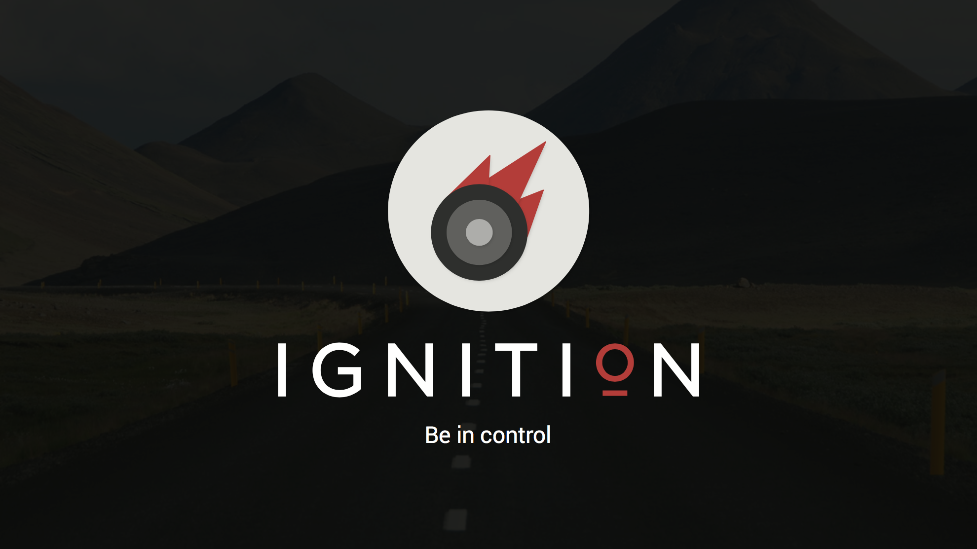
Ignition
Identify problems, buy parts, and fix cars on your own.
View slide deck View process View prototype
Our final deliverable is an interactive prototype featuring this application and its features. This project took 6 weeks, from the conception of this idea to the showcasing of our app using a website. Please visit the site to view our design process in depth.
We wanted to make vehicle maintenance easier for interested car owners. The app follows a flow from identifying your car issue, to finding relevant parts and tools, to fixing the identified problem through video and text tutorials.
My Role
I wireframed and created mockups for the onboarding, home and secondary screens. I also maintained the design consistency during every stage of the process by revisiting all the team members' files and making sure they all fit together. As a part of the deliverables, I helped code the website whilst adding a timeline navigation that derived from our presentations.
Human Problems
When something goes wrong with your car, the repair process can be quite frustrating. We interviewed a few car owners to determine whether these frustrations turn out to be true. In addition, we looked at existing car repair apps to see what might be lacking. We found a couple motivations from owners: the desire to save money by avoiding the car shop, the interest in learning about the car they drive everyday, and some mistrust between the owner and the mechanic in terms of doing a bad job or overcharging.
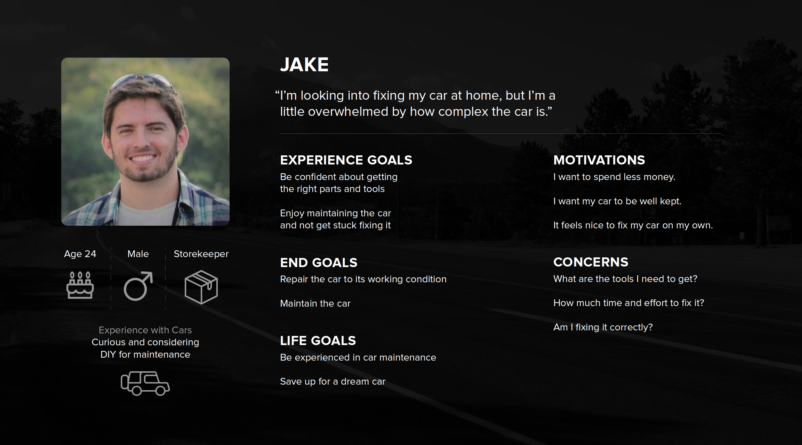
Our main user group focused on enthused car owners. We've identified and consolidated the overwhelming repair process into three main steps: identify the vehicular problem, find the required tools and parts, and fix the problem.
Insight
An important challenge we faced was using unique interactions for the flow of our app. How do we maintain an intuitive flow through the three main sections and their subsections? Throughout our development, we reiterated a critical timeline feature that helped the user know their place in the app.
Another challenge was the presence of accessory screens, which weren’t charged with purpose. Using feedback we integrated the separate pages into a single home screen, each with actionable content, instead of being hidden in a sidebar.
Design Process
I was in charge of consolidating everyone's wireframes and mockups before every review. I made sure all of the screens were consistent with each other and used the same styling that we established in the style guide.
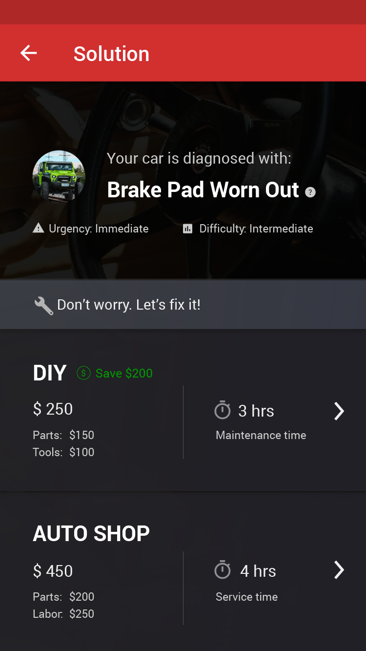
We let the user quickly identify the problem via a separate OBD Key device, or by searching up the problem via keywords. Once the problem is identified, the app will help inform the user whether to send it in, or fix it themselves. Variables like urgency, difficulty, pricing, and service time is presented for them to make the decision.
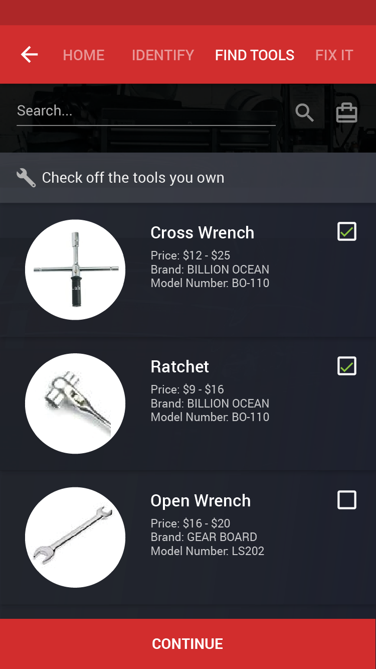
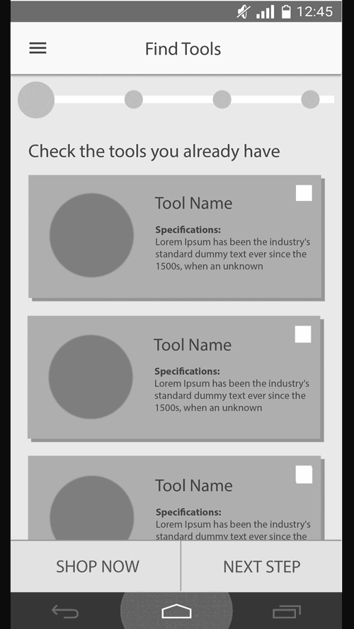
Every problem has its own required parts and tools to fix the problem. This step shows the these parts you need, and keeps track of which items you have already. If you are missing parts, the app will find the stores closest to you with the prices of the parts. The app makes sure that you have all of the parts before moving to the next step.
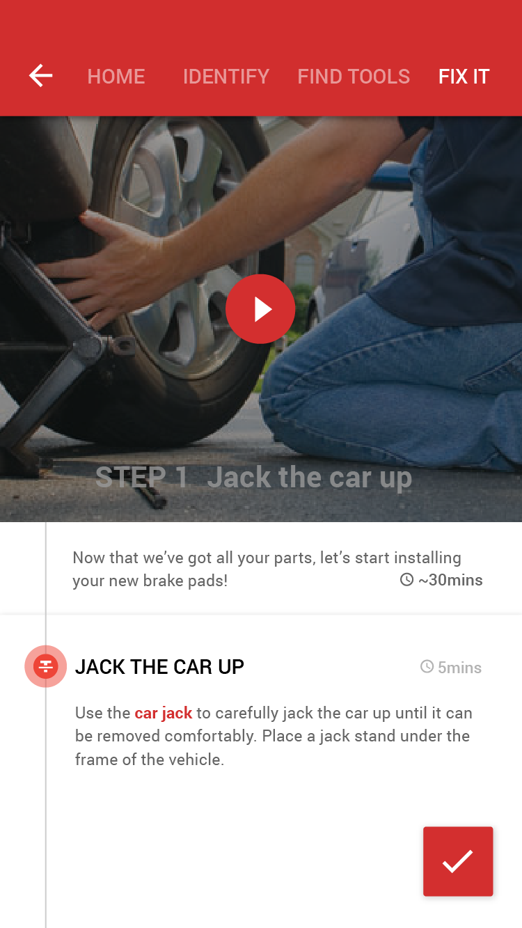
Ignition provides step-by-step instructions to fix the issue, accompanied with videos for the more common problems. Intermediate and expert users can skip steps, whereas we make sure beginners can’t skip crucial steps.
By bringing the prototype to car owners to test, we identified several validations, as well as issues that we would need to fix in the future. Navigation continued to be a problem for us, that is how to make the main navigation bar, and progress bar clear yet can communicate app status. Find Tools was confusing as there was a conflict between checking tools for toolbox or for shopping. There was validation that experts liked to skip and scan over steps, and that beginners are okay with single step-by-step to avoid being overwhelmed. Lastly, the app was motivating for them to attempt to fix their car. They were appreciative of being up front about the cost and time tradeoffs with DIY and sending it to the car shop.
Outcome
We created a smart and helpful app that could be useful even for more experienced drivers. I feel that some of the interactions could be refined to a greater degree, involving clearer flows within each step of the app. I noticed in hindsight that we self-imposed a false constraint of needing to follow the Material Design language. Regardless, in the end I felt that our application stood out among our peers due to the practical need of fixing cars and the unique domain that wasn’t done before in the class.