Recognition
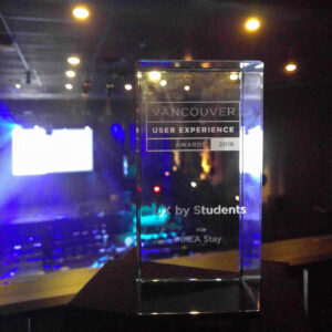
“UX by Students” + “People’s Choice”
at Vancouver UX Awards 2016
Timeline
4-week intensive project timeline
2015
Roles
Product, UX, research, business strategy, frontend
IKEA is the biggest player in physical furniture retail but has fallen behind in e-commerce growth. As urban professionals increasingly move cities for work and rely on short-term rentals, there’s an opportunity to bring IKEA’s showroom expertise into the online world through lived experiences.
Introduction
IKEA Stay emerged from an intense 4-week project that took us from identifying a business problem to designing a complete experience and developing a working prototype for our program’s destination course.
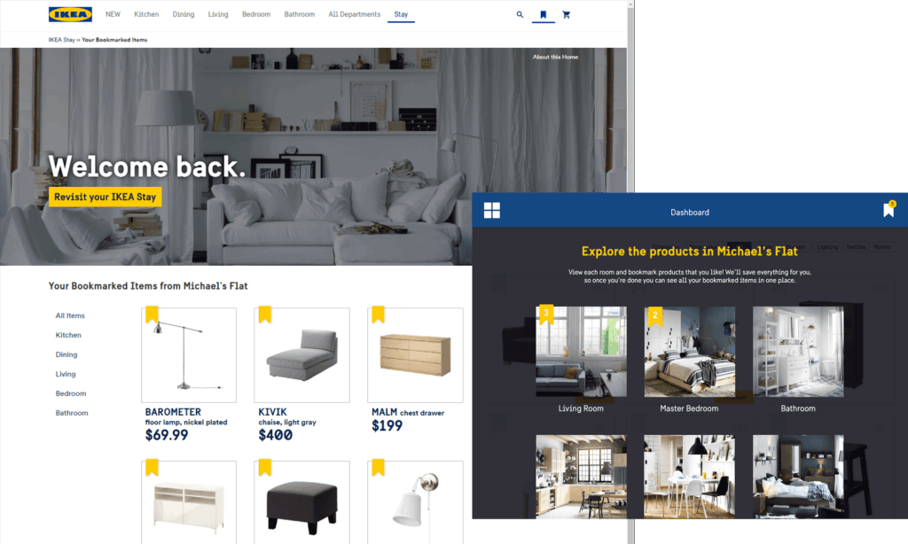
The concept: visitors stay at short-term Airbnb rentals furnished with IKEA products they can try in real living situations. A tablet in each home features the furnished products which guests can save for later review. A post-stay website allows customers to purchase products they loved and explore how those same items look in other home contexts.
This multi-modal experience bridges IKEA’s physical showroom strength with the growing demand for online furniture shopping, while solving a key urban problem – accessing IKEA stores from city centers.
My Role
I helped find IKEA’s business challenges and identified the target user opportunity that became our core insight. I designed most of the web experience and built the entire web prototype, while collaborating on the overall service design and business strategy.
The Problem We Discovered
Initially, we knew IKEA was struggling with e-commerce growth despite their stellar showroom experience. Having fallen behind on the growth of popularity of online shopping, can we bring IKEA’s showroom expertise into the online world?
IKEA […] now finds itself playing catch-up to more web-savvy rivals, racing to put more of its Lack coffee tables and Billy shelving online.
Hiroko Tabuchi, New York Times
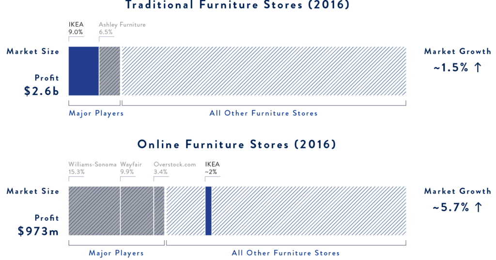
Taking what I learned from entrepreneurship courses, I analyzed industry reports for both online and traditional furniture stores in North America. The data revealed that while IKEA dominated traditional retail, online shopping represented a massive growth opportunity they were missing.

The Real Insight
The breakthrough came during what seemed like a dull brainstorming session. I realized we were seeing a perfect storm of trends:
- Urban Migration Pattern: Young professionals moving to new cities for work, using short-term rentals while searching for long-term homes.
- Geographic Challenge: IKEA stores are typically far from urban centres – Seattle’s closest IKEA is in Renton, 30 minutes by car or 1 hour by transit.
- Resource Match: IKEA’s affordable appeal perfectly matched resource-limited urban professionals.
IKEA is permeating Airbnb’s 1.5 million listings. Show me a one-bedroom riverfront apartment for rent in Klaipeda, Lithuania, and I’ll show you a Poang chair.
Julie Laksy, design journalist, former deputy editor New York Times
What if we turned this unintentional infiltration into an intentional experience?
Understanding Our Users
Through our IKEA store visits, we identified key user pain points:
- Disconnect between idealized showrooms and real home experiences
- Difficulty imagining how furniture works in actual living spaces
- Geographic barriers to accessing physical stores from urban centres
- Uncertainty about styling and pairing furniture pieces
We discovered that urban professionals were already living with IKEA furniture in Airbnb rentals, but had no way to identify, learn about, or purchase the pieces they experienced.
IKEA Stay Experience

Discover
Guests discover IKEA-furnished homes while browsing Airbnb listings. Rather than building a proprietary rental system, we leverage Airbnb’s existing high-traffic platform. This makes IKEA products accessible in urban centers where physical stores aren’t viable.


Engage
Upon arrival, guests find a tablet featuring all the IKEA products in the home. They can explore product details, save items for later review, and most importantly – actually live with the furniture before making purchase decisions. This tablet experience transforms the space into a lived-in showroom.
The live-and-try concept eliminates buyer’s remorse by letting guests experience furniture in real settings rather than idealized showroom contexts.
Explore
After their stay, guests can review saved products and make purchases through our web platform. The system integrates with IKEA’s existing e-commerce infrastructure.
Guests can also explore how their saved products look in other IKEA Stay homes, solving the styling uncertainty problem by showing multiple real-world contexts for the same pieces.
Recognition
UX by Students
at Vancouver UX Awards 2016
Recognition
People’s Choice
at Vancouver UX Awards 2016

Impact & Results
This concept demonstrated potential for sector-wide transformation in how furniture retail and short-term rentals could collaborate. The live-in showroom model could expand beyond IKEA to other furniture retailers, while short-term rental platforms could add product discovery as a revenue stream.
The solution also aligned with IKEA’s democratic design principle – making their products more accessible in urban areas where traditional stores aren’t feasible.
As far as legal issues we were concerned with, IKEA Stay would operate with respect to the local laws, akin to hotels and short-term rentals, like how Airbnb is currently managing. We would find hosts that honour these regulations.
What This Project Taught Me
This project showed me how powerful it can be to widen the problem scope beyond the obvious solution. Instead of just improving IKEA’s website, we discovered an entirely new business model by recognizing patterns in urban migration, existing user behaviour, and geographic constraints.
I learned that the most compelling design opportunities often exist at the intersection of multiple trends – in this case, e-commerce growth, urban migration, sharing economy platforms, and retail accessibility challenges.
Looking Forward
IKEA Stay opens possibilities for furniture retailers to create experiential touchpoints beyond traditional stores. The concept could scale through partnerships with rental platforms, or IKEA could develop its own rental network in strategic urban markets.
The model also suggests how other product categories – from kitchen appliances to home tech – could benefit from try-before-you-buy experiences embedded in real living contexts.
Team
Edward Chen, Tiffany Cheng, Haley Clarke, Robbie Sebullen, Maurice Yu
Tools
Illustrator, HTML, CSS, Javascript

