Statements
See all your spending at a glance.
View slide deck View mockup demo
Statements is a personal project intended to showcase my user experience design abilities, from design research to prototyping, as well as improve my technical skill with Sketch. View my slide deck below for a quick overview!
In essence, Statements is an unsolicited feature designed to keep track of your spending. It splits different aspects of life into categories, showing snapshots that help you identify spending habits.
Origin Story
This idea started during my studies in entrepreneurship. I was curious whether it would be possible to manage personal finances as if it were a business, and have it easy to digest for the average user. This project involved research for a design rationale, journeymapping for identifying user frictions, and interface design that maintains clarity.
Frictions and Opportunities
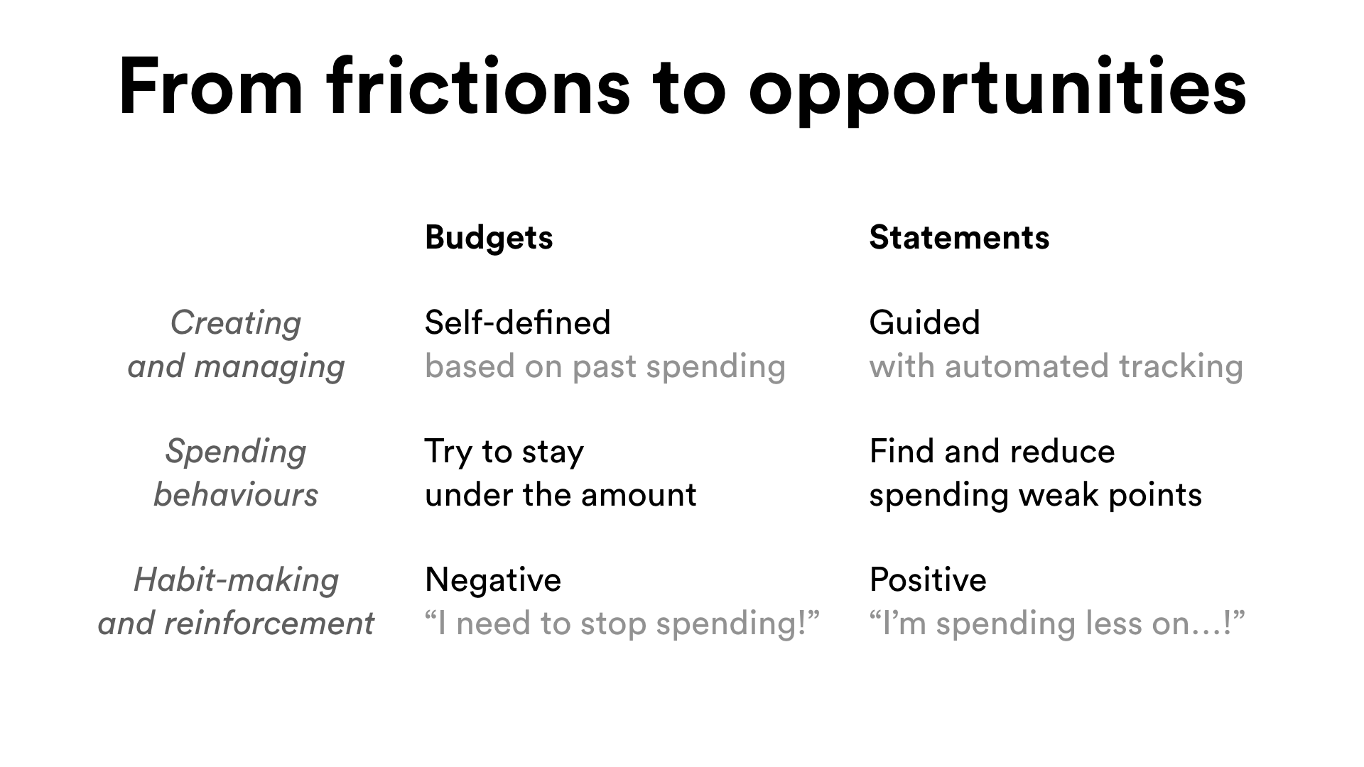
As with any well designed product, Statements required a rationale for its existence. Aside from the feeling that financial literacy is crucial for everyones' wellbeing, individuals and families mostly rely on budgeting to keep their spending in check. Finding a balance between saving up and having a livable condition is a priority for many, despite its difficulty.
“No one talks about how difficult it is to fulfill being a 'young person,' travelling, enjoying your twenties, having fun, seemingly at the same time as becoming a 'fiscally savvy adult.' They seem to contradict, and figuring it all out on your own is confusing and daunting.” L.G., Toronto (The Globe and Mail, 2017)
Somebody who hasn't budgeted before will find it hard to get started, since a lot of initial guesswork is required. Mint's trends history can help visualize spending, but lacks the integration and insight that Statements would provide.
“...As you get more comfortable with your monthly spending habits, this 50/30/20 ratio will change, eventually skewing toward saving more. Please remember, budgeting is often very trial-and-error. You may need to adjust it on a monthly basis until you get in a groove.” Ron Brown (Investopedia, 2017)
Additionally, since budgets are mostly built by the user, it may be less obvious to detect spending habits that might be areas for reducing spending.
Design Process
This portfolio piece is a work in progress. More to come!
Compared to budgeting, Statements focuses on a different perspective of spending: "Did I reach my limit?" versus "How did I spend this month?"; that not all spending is necessarily detrimental to your financial wellbeing.
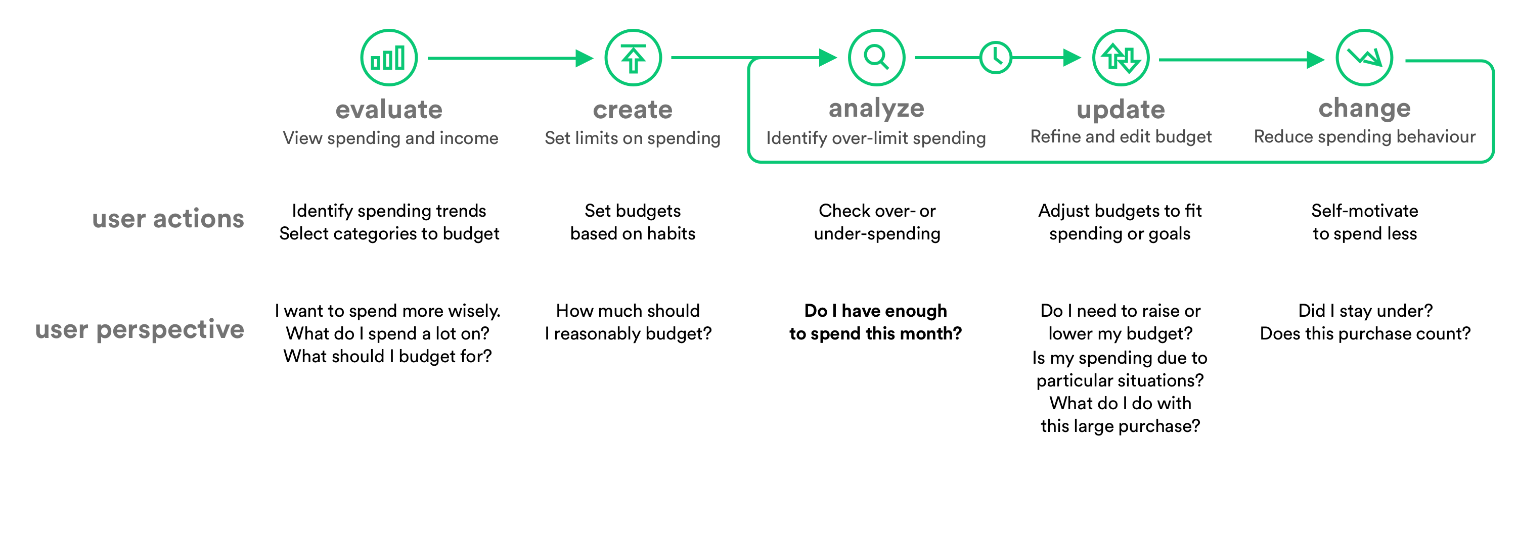
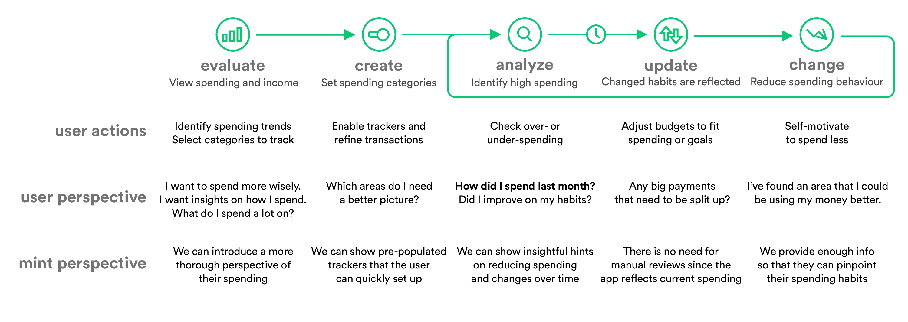
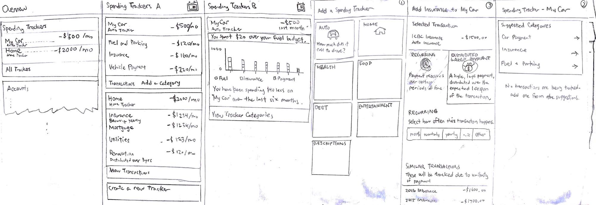
An initial set of wireframes before reiterating on the design. The old wireframes followed a more technical screen flow (ie. overview, create, edit, delete screens) that was missing the focus of the user.
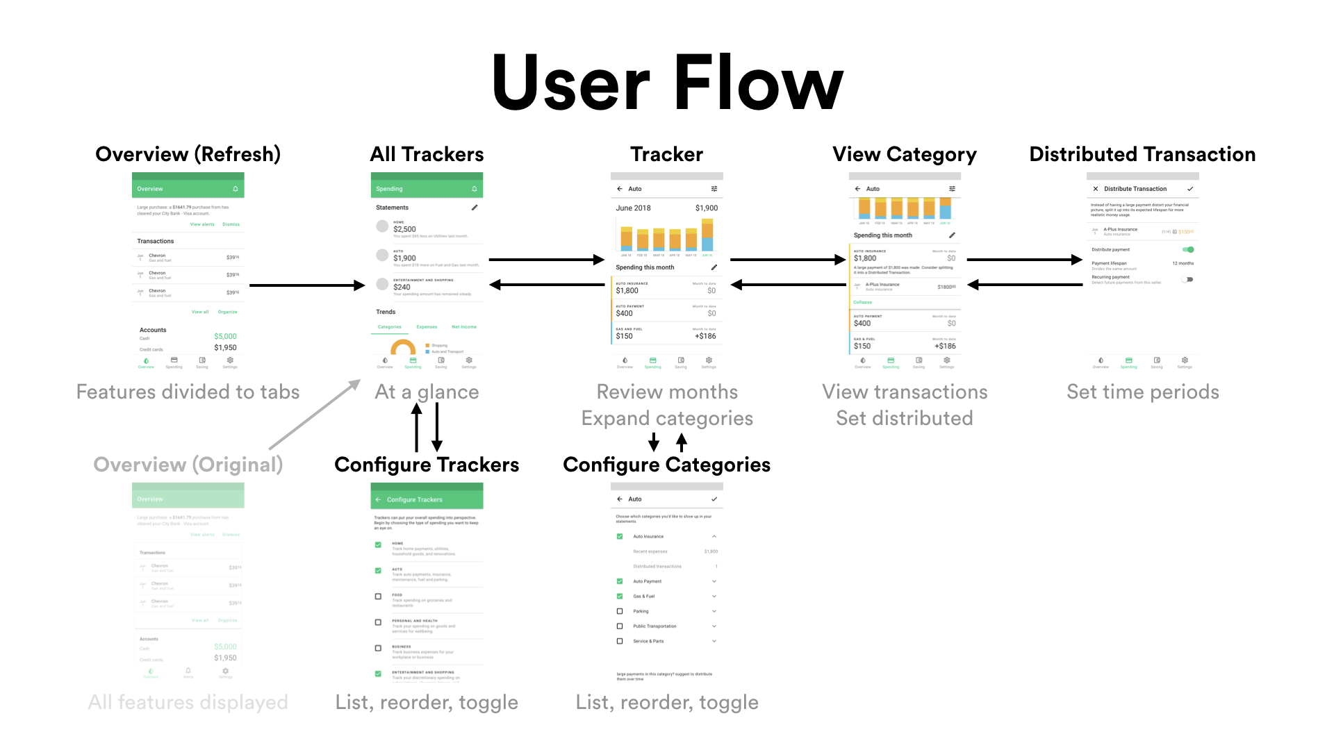
This new user flow reduces the amount of screens needed to access and edit information.
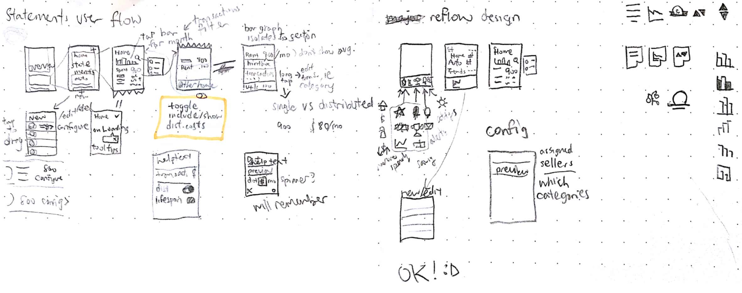
Oftentimes, tiny wireframe sketches help me identify what is absolutely essential in a particular screen.
Experience Tour
Statements is a small-scope project, and provides two main functionalities, the spending trackers, and distributed transactions. (Screens are mostly complete, but some require refinement.)
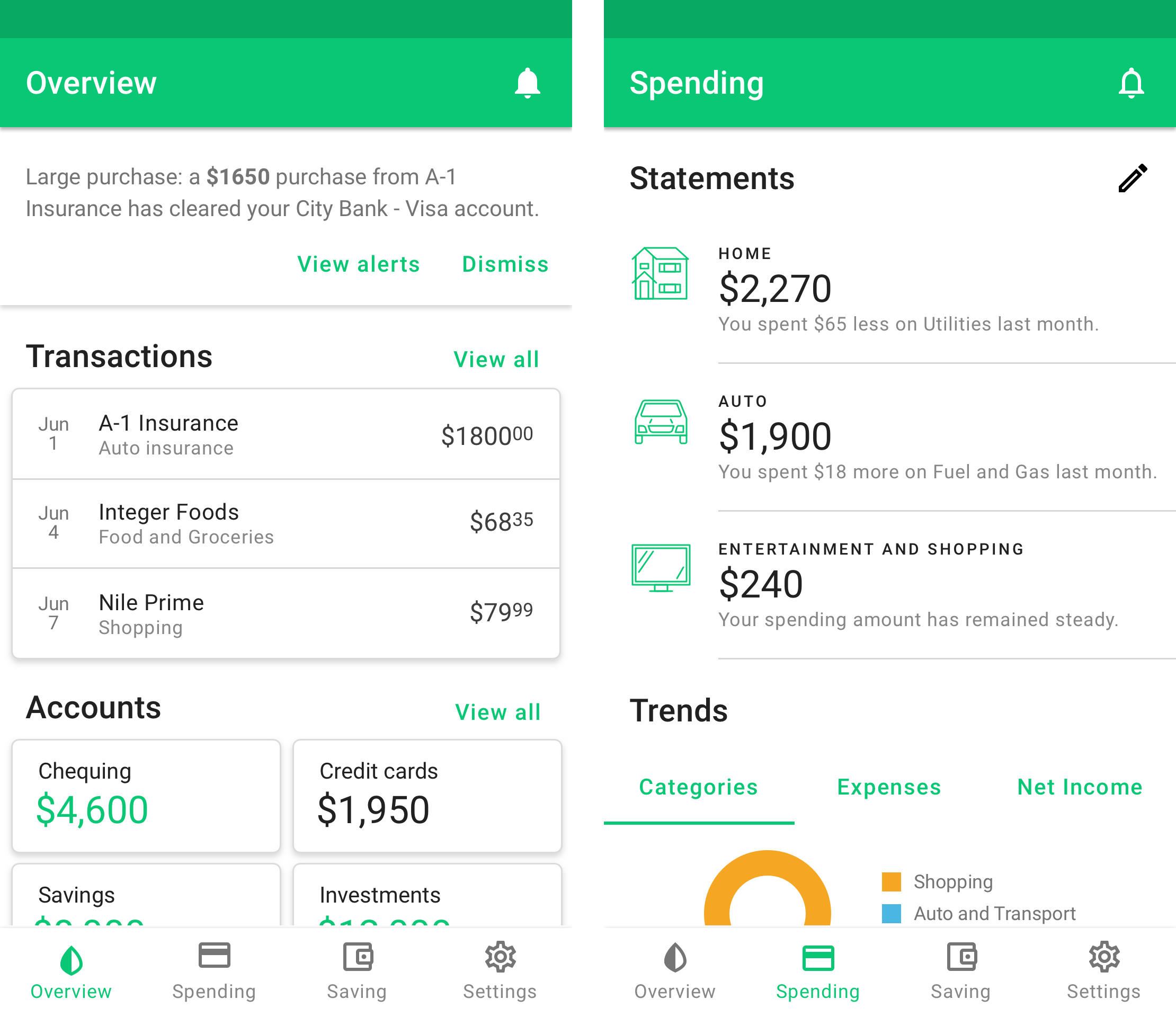
I introduced a refreshed navigation, where cluttered views are moved to the Spending and Saving tabs. The interface leaves its original card layout to allow for more flexibility in terms of interacting with the information.
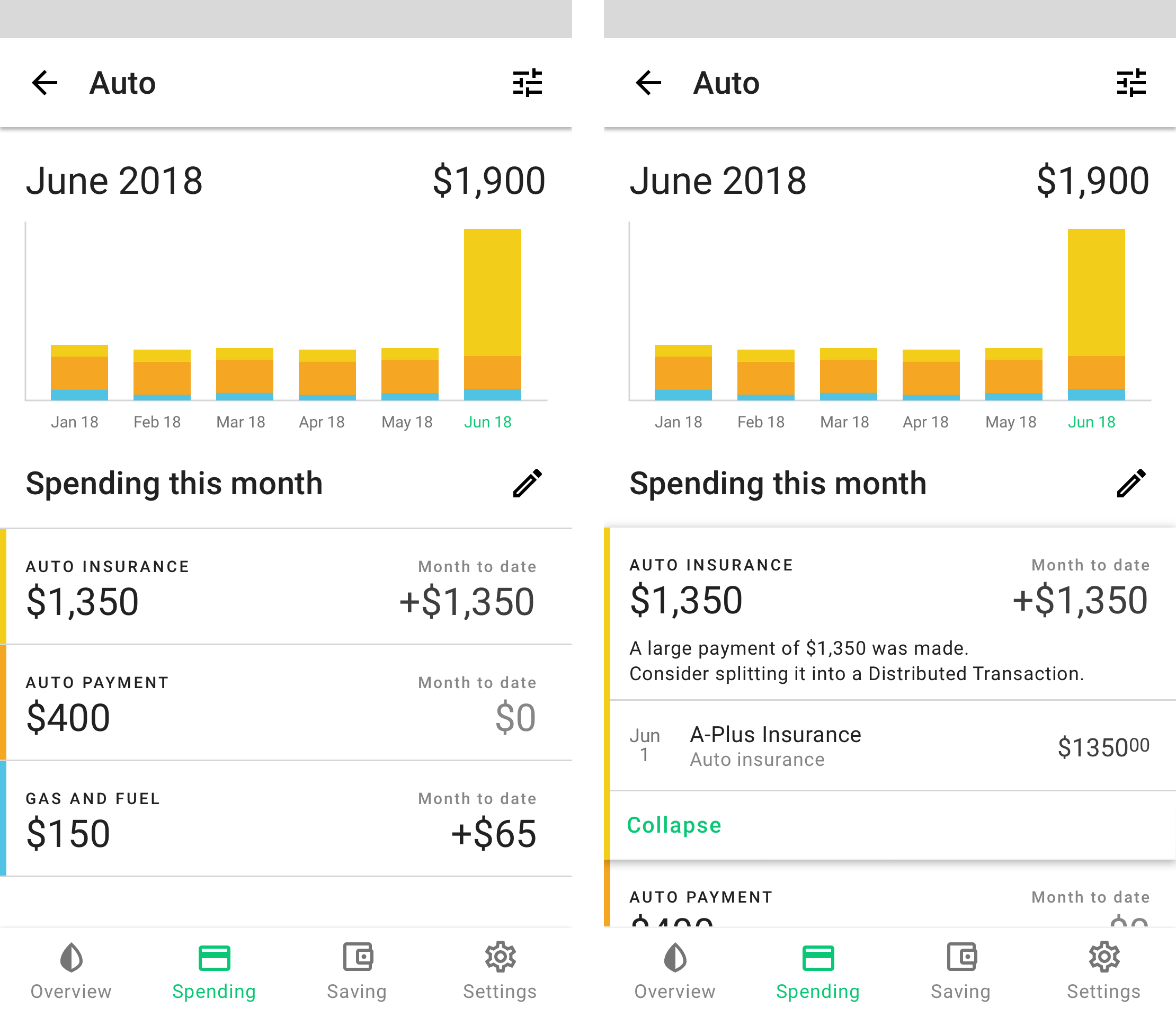
A graph summarizes your spending history, along a list of spending changes in each individual category. Brief insights show potential items to reduce spending, or suggest the distributed transactions feature if there are large payments.
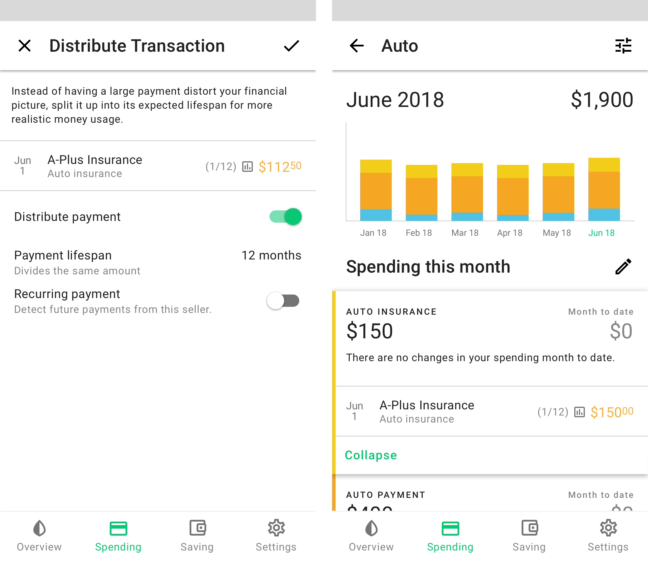
Sometimes, large payments are intended to last a period of time. For example, a single auto insurance payment lasts the whole year, or a lawn mower is distributed to its expected lifespan of 4 years. Distributed transactions prevent your spending trends to spike, or allow you to properly represent an investment's value over time. This idea was adapted from business finances, AKA amortization.
Outcome
This was a chance to create from scratch a new idea that I found interesting. I was able to exercise my UX and UI design skills, to keep myself up-to-date on design norms, and improve my proficiency with Sketch.
Is this something you'd love to have for all your finances? You're not alone - I've shared all this with a few people so far, and they found this to be quite desirable. I hope to fully test it with more audiences and see its viability. Even if the idea might end up failing with larger audiences (since I haven't tested it in the world), I would be happy that I've worked through this whole process, and keep my design muscles in check.
